
Key Visual Design for Billboards, Print, Social and Display
By Dahlia | Creative Design, MOX Team
A campaign can look compelling on a designer’s screen and still fail in the real world. A billboard may be noticed for only a few seconds. A magazine advertisement gives someone time to look closer. A social post competes with the next swipe. A digital display banner might have barely enough room for a headline.
Good key visual design gives a campaign a recognisable identity and adapts the layout to how people actually see each ad.
Here is how I would approach that challenge, from the first visual concept to the final production files.
What makes key visual design work across platforms?
A key visual is the combination of imagery, message, typography and colour that makes ads recognisable as part of the same campaign. It gives a designer a starting point for each new format.
Before choosing a layout, I would ask three questions. What must the audience remember? What visual element carries that message? And which elements are essential to recognition when space or attention becomes limited?
For example, imagine an illustrative campaign for a fictional citrus drink, SOLA. Its idea is “Refresh Your Day.” A vivid orange sun-circle, a chilled product image, a deep navy background and a short headline form the campaign’s visual language. The proportions can change as long as those cues remain recognisable.
The SOLA artwork is a fictional campaign concept.
One creative idea, four very different environments
The most revealing part of campaign design happens when the master creative has to leave its original canvas. The brief remains the same, but the viewing conditions change.
1. Outdoor billboard: recognition at a distance
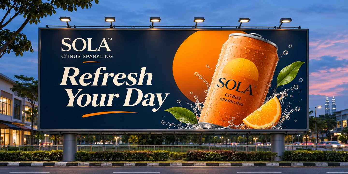
A roadside billboard has to communicate quickly. The product, the headline and one distinctive brand cue should dominate. Small supporting copy, multiple messages and delicate typography that work on a desktop layout are likely to disappear at a distance.
For SOLA, I would enlarge the product, keep the copy to “Refresh Your Day”, and use the orange sun-circle as a bold, instantly recognisable shape. I would also assess the actual placement: a slow-moving pedestrian location is not the same as a high-speed roadside site. Readability must be tested at realistic scale and viewing distance, not judged only at 100% zoom.
2. Print advertisement: reward a closer look

Print offers a different opportunity. A reader can pause, inspect the product and absorb secondary information. That makes room for a supporting line, product details or a more nuanced composition—provided the main message still leads.
Here the hierarchy might be headline first, product second, supporting explanation third. Production decisions include trim and bleed, image resolution at final size, colour management, paper stock and printer specifications. A print proof shows how the artwork’s colours will reproduce on the chosen stock.
3. Social media: design for a moving feed

A vertical social placement has to earn attention within a crowded, fast-moving environment. A layout designed for a wide billboard cannot simply be squeezed into a portrait frame. The product and key message may need to move, the background may need to simplify, and the composition must account for interface overlays and platform-specific safe areas.
For SOLA, the product could move to the centre with the orange sun-circle behind it, while the headline shifts above or below the focal point. If the campaign uses motion, the opening frame must still communicate the idea before the viewer scrolls away.
4. Digital display: prioritise the smallest usable message
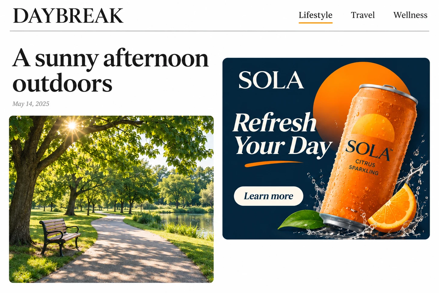
A compact web display ad presents an even tighter constraint. The creative may have only enough space for the brand, one benefit and a clear next step. For SOLA, I would pair the headline and can with one button, “Learn more”, and check the result at the unit’s actual size. A 300 × 250 inline rectangle is one example.
Rather than shrinking every element, I would rebuild the hierarchy around what the audience needs to notice and do. The call to action belongs here when the placement and objective warrant it; it does not need to be forced into an outdoor execution.
What changes when you adapt a key visual?
Compare the billboard with the social ad. On the billboard, the headline and can sit side by side and use most of the available width. In the feed, the headline sits above the can and both have room to read on a narrow screen. The orange circle, navy background and product still connect the two.
The production decisions clients rarely see
Thoughtful advertising creative design also requires technical judgement. A strong idea can be weakened by poor execution long after the initial concept has been approved.
- Image quality: confirm effective resolution at the final physical dimensions and follow the production vendor’s specifications rather than applying a universal DPI rule to every format.
- Colour: work with the appropriate RGB or CMYK workflow and request proofs when colour fidelity matters; different screens, inks and materials reproduce colour differently.
- Typography: check legibility at the actual display size, including the smallest text that must legally or commercially appear.
- Format and safe areas: account for trim, bleed, folds, crops, responsive placements and interface overlays.
- File handover: verify dimensions, linked assets, export formats, naming conventions and vendor requirements before release.
These checks may sound operational, but they are part of creative quality. The audience never sees the source file; they experience the final execution.
How I would protect consistency without making every design identical
I would begin with a small set of non-negotiable creative anchors: the central idea, brand identity, core visual motif and tone of voice. Everything else should be evaluated against the audience, medium and campaign objective.
A useful review is to place all adaptations side by side and ask: Do they clearly belong to the same campaign? Can each one be understood in its own environment? Has any adaptation lost the original message? If the answer to the first question is yes but the second is no, we may have consistency without effectiveness.
I would approve the master creative first, then review each adaptation at its intended size before checking the set together.
What this means for businesses commissioning creative work
When commissioning a multi-platform campaign, a business should brief the designer on more than the number of sizes required. Share the audience, the single most important message, the media plan, placement specifications and the action each format is expected to support.
Agree on which brand elements must carry across placements and how you’ll judge whether each execution communicates the message clearly.
Good design does not guarantee campaign performance; media placement, offer, audience and measurement also matter. But a thoughtful adaptation process helps avoid preventable communication problems before the campaign goes live.
Keep the campaign idea recognisable
After working across traditional and digital formats, the principle I return to is simple: strong key visual design makes the original idea clear wherever the ad appears.
If you’re planning a campaign across multiple channels, see how MOX Team can help with campaign creative or tell us about your campaign brief.
Frequently asked questions
What is key visual design in advertising?
It is the central visual concept and set of recognisable design elements that connect a campaign’s executions across media.
Is adapting a campaign the same as resizing artwork?
No. Resizing changes dimensions; adaptation may change hierarchy, cropping, typography, copy and calls to action to suit a placement.
Should billboard and social media ads use identical layouts?
Not necessarily. They should share recognisable brand and campaign cues, but their viewing conditions and available space call for different executions.
What should a client provide for multi-platform campaign design?
A clear objective, audience, key message, brand assets, media placements, technical specifications and approval requirements.